Gaming & Esports · Café
TGT Esports Studio
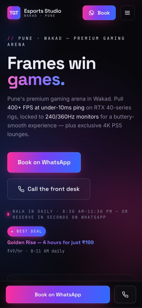
Pune's premium gaming café had a competent but templated site: the same dark-purple gaming-zone look as everyone else. We rebuilt it from scratch into a cinematic "neon arena" that finally matches the strength of their brand.
Interactive preview. Scroll & click inside, or open the full site (best on desktop with a mouse)
The brief
Look the part, own the brand.
Their old site was competent but templated. A generic dark-purple gaming template, flat card grids, emoji icons and weak hierarchy, all reading like every other gaming zone in the city.
Yet their actual brand was genuinely strong: a chrome TGT monogram forged onto a magenta-to-violet-to-blue gradient. The site just didn't live up to it.
What we did
A cinematic neon arena.
We built fresh DNA straight from the logo gradient and gave it an ownable signature: a monospace HUD spec-readout for prices and specs, like an in-game overlay.
- — Rebuilt on the logo's magenta → violet → electric gradient over near-black.
- — Pulled real venue photos from Google Maps and surfaced the live 4.8★ / 169-review rating.
- — Added a custom crosshair cursor + pointer-tracking spotlight, giving a shooter-game feel that fits the audience.
- — WhatsApp-first booking, tabbed passes, and a scrolling wall of Google reviews.
Palette
Typography
Highlights
Live Google rating (169 reviews) surfaced as proof.
Their own photos, integrated so the site feels like the café.
A monospace spec-readout signature that's ownable, not generic.
Custom shooter-style cursor + pointer-tracking spotlight.